A lot of my readers prefer to read ebooks over print books, but there are still a big chunk who enjoy reading paperbacks. Always eager to please, I’ve been investigating the two most commonly used print on demand companies used by indie authors – Createspace and Ingram Spark. I recently placed an order for some copies of my new book, Space Team, from each printer, and thought I’d do a comparison in case anyone is looking to use either for their book printing needs.
Ready? Here goes.
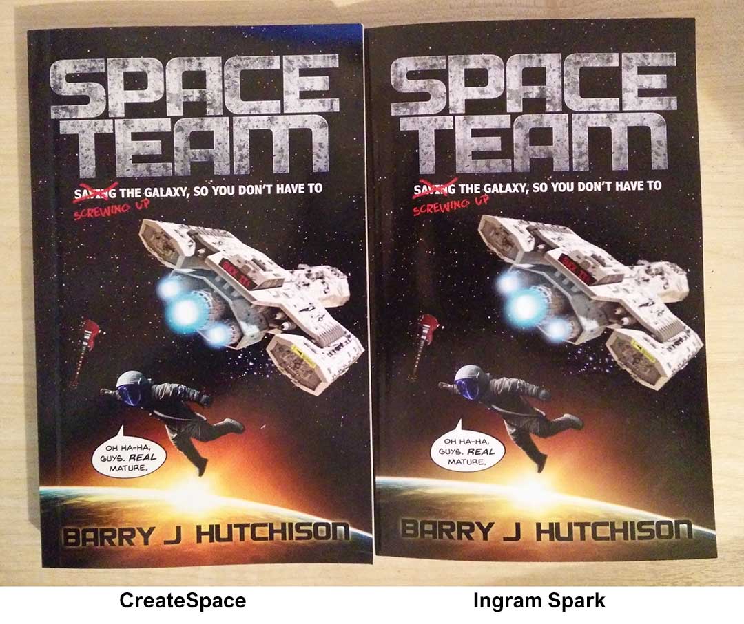
Createspace Vs Ingram Spark
The Outside
First of all, apologies for the photo quality. I took the pictures on my phone in a room that probably could’ve done with having another light on. Sorry about that.
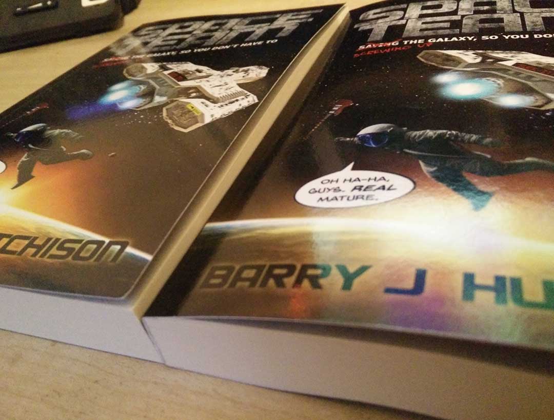
At first glance, it looks like both books are near to identical on the outside. On closer inspection, though, it’s obvious that the IngramSpark colors aren’t as vivid or vibrant as those from Createspace, as the next few pictures will hopefully show.
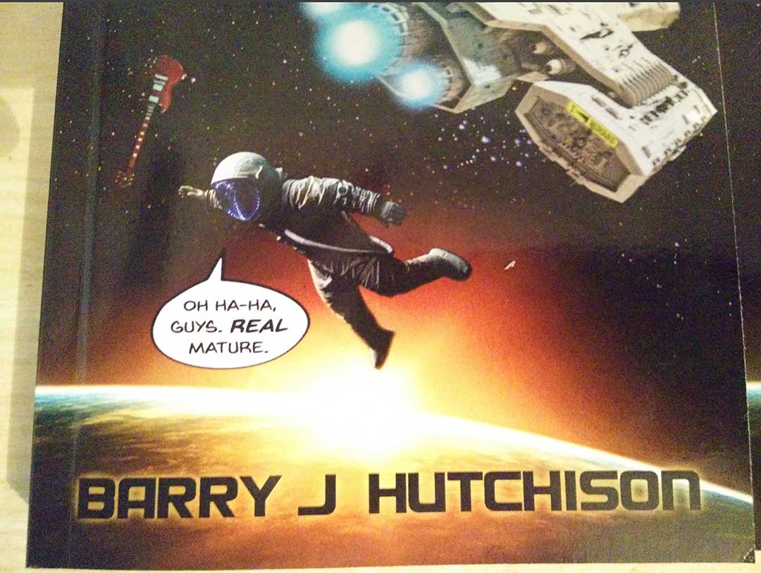
Createspace cover close-up
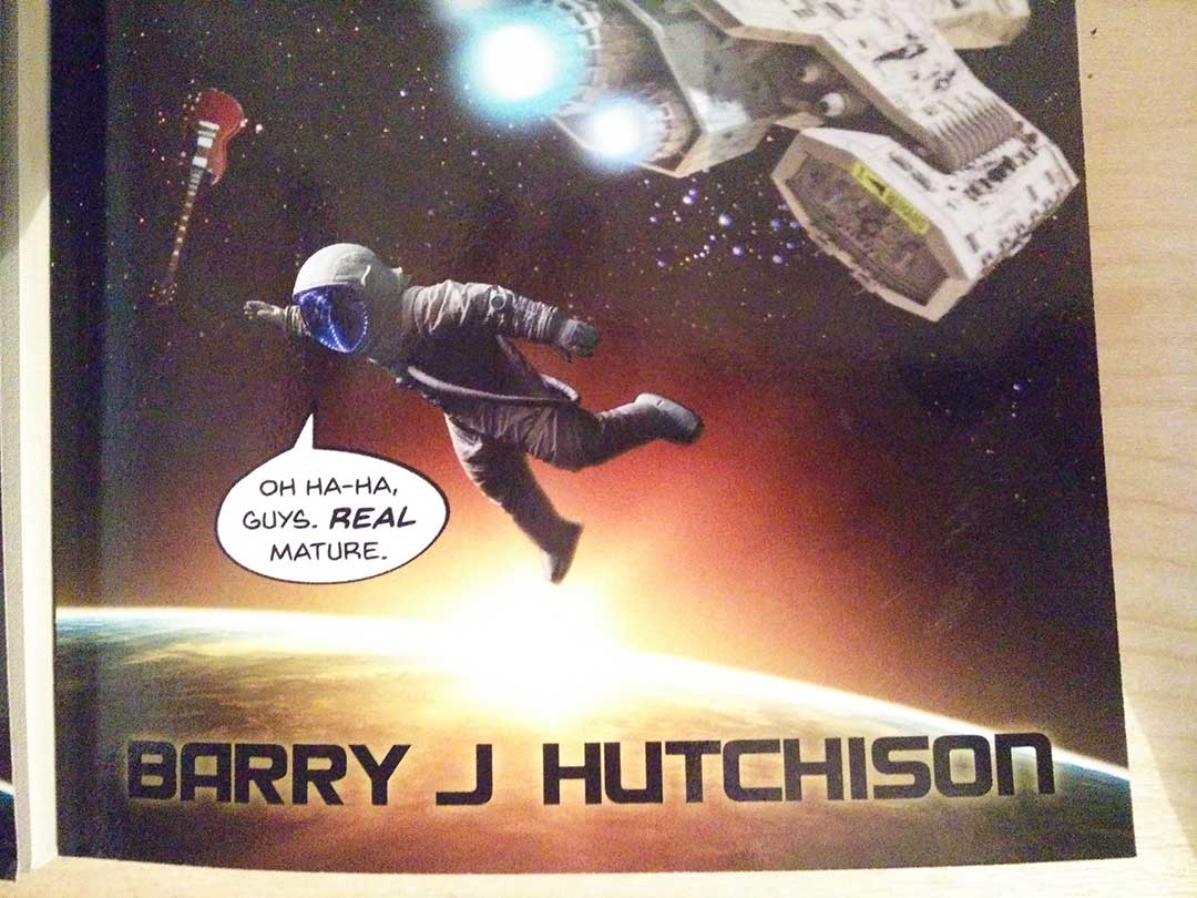
Ingram Spark cover close up
Now, from the above it might look like IngramSpark is more true-to-life, while Createspace looks artificially bright, but holding them in my hand, all I think is that Createspace looks better. The astronaut pops out from the background much more, although there’s some more defined ‘banding’ in the sun glow on the Createspace cover, while the Ingram Spark glow graduates more smoothly between the shades. Still, on the whole I prefer the Createspace colors.
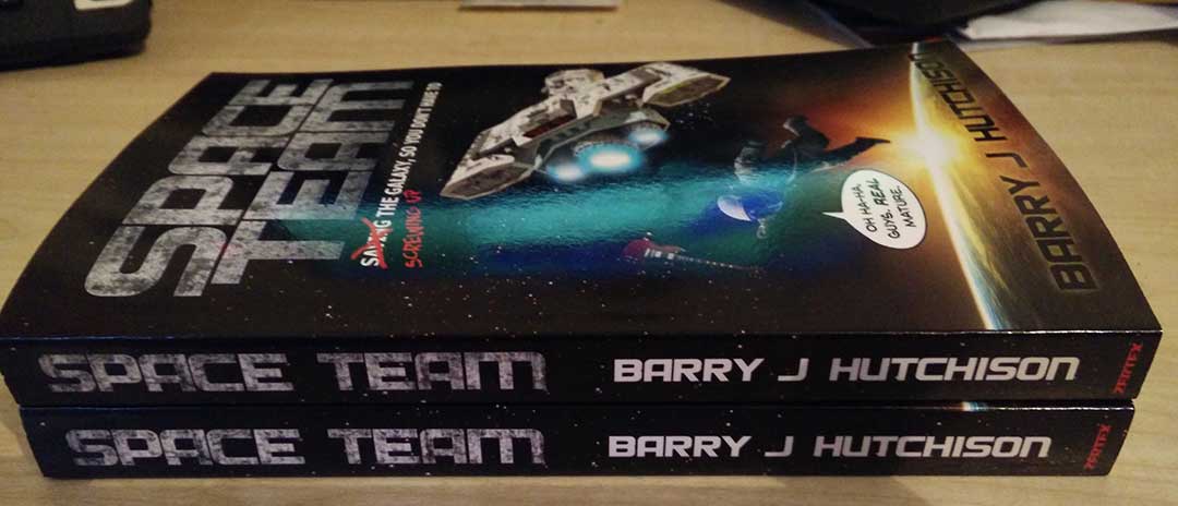
Createspace is on top here. Literally.
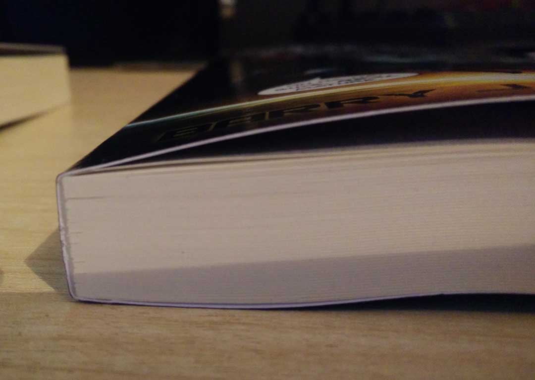
When I was setting up the files, the Ingram Spark version came out a tiny bit thinner compared to the Createspace version, but not enough that I had to adjust my cover sizes. Space Team is 274 pages, so if your book is substantially more than that, spine sizes might differ quite a bit more.
It’s odd, but when I place the books side by side with the Ingram Spark book on the right, it seems quite a bit thinner than the Createspace version. This photo should show what I mean.
It wasn’t even that the Createspace pages were lifting or anything – if I pressed both covers down the result was the same. If I swapped positions and put the Createspace book on the right, the spine lined up perfectly with the pages of the Ingram Spark book, and both copies appeared to be the same thickness. I have no explanation for it, other than that the Ingram Spark spine is substantially ‘pulled in’ compared to the rest of the book.
Whatever the reason, the Createspace book feels slightly heavier and more ‘solid’ in the hand. I’m pretty sure the cover stock is thicker with the Createspace book compared to the Ingram Spark version, which makes it feel like a slightly better product. There’s not much in it, though.
What I do prefer about the Ingram Spark book is how neatly the pages are bound. Someone at Createspace seems to have gone overboard with the glue gun when sticking the pages in place, as you’ll see below.
Ingram Spark neatness
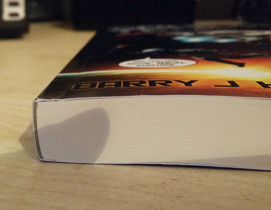
Clumsy Createspace glue bomb
Will 99.9% of readers notice this? Probably not, but I picked up on it, so thought it was worth mentioning.
The Inside
But enough about the outside. We probably shouldn’t be judging the books by their cover. I mean, there’s probably even a saying about that or something. Let’s take a look at what they’ve got where it counts.
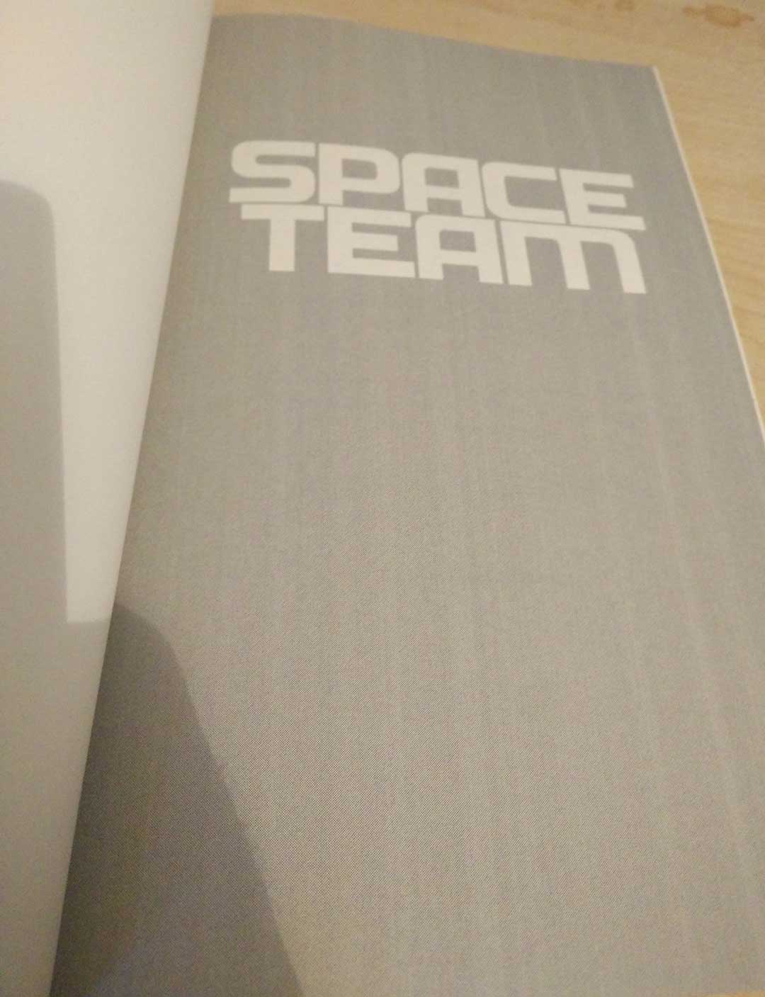
The first page of Space Team is this… I don’t know what you call it. Title page, I guess. I decided to make it all a uniform shade of gray to see what would happen. Neither printer knocked it out of the park with this, if I’m honest. Createspace seemed to have a lot of lines running down the page. Ingram Spark had them, too, but not to the same extent. You may not be able to see much difference in the photos, but side by side Ingram Spark wins this one hands down.
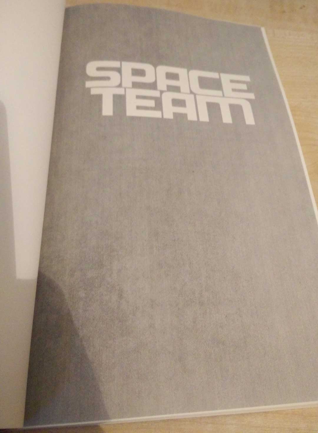
Ingram Spark
Createspace
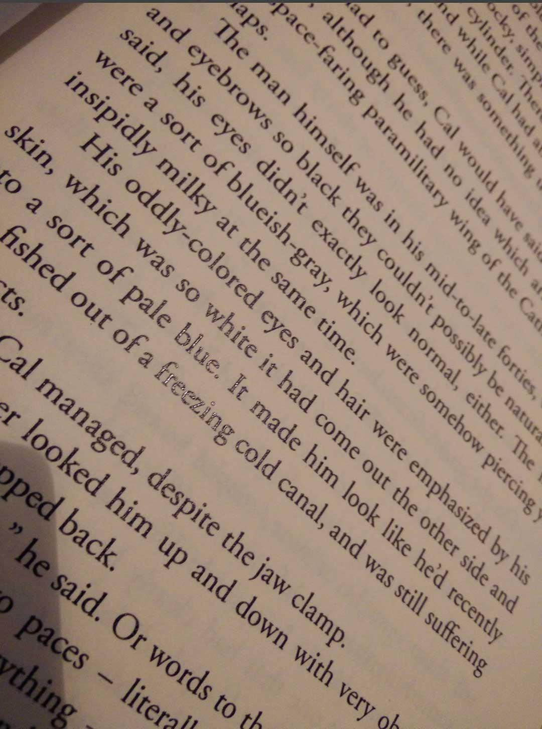
Ultimately, though, if anyone is spending a lot of time on this page they’ve clearly got issues. The rest of the book is where the action (and story) is, and while both printers delivered crisp, clear text on virtually identical cream paper, there was something a little bit annoying about the Ingram Spark print. Check out the photos.
Ingram Spark

Createspace
Notice that shine on some of the Ingram Spark print? It’s most noticeable above on the words ‘blue’ and ‘freezing’, but it’s there on every word, just waiting for the light to hit it the wrong way. The Createspace print doesn’t have the glossy shine effect which, to my eyes, makes it easier to read, and just makes it look more professional.
Overall, based just on the quality of the two books I received, I have to give the win to Createspace. Now, there are some other advantages that Ingram Spark offers in terms of getting your books into bookshops, fast and cheap UK delivery (very handy for me), etc, but on a pure head-to-head quality comparison, Createspace takes the win.

Thanks for this! Just what I have been looking for.
Thanks for doing this! Great comparison. The IngramSpark ed. cover almost looks like a screencap of a cover, not a real cover, if that makes sense. Do the books weigh the same?
The CS book is slightly heavier and just feels a bit more of a quality product. There’s not much in it, though, and if you weren’t directly comparing them side by side, I doubt anyone would notice.
Another author friend recommended Ingram Spark, primarily for their distribution network. Currently, I’m doing my paperback print copies through Snowfall Press. Their quality seems good, their prices reasonable, and their turn-around time fairly quick. The drawback is they are strictly a print service. They do not handle any distribution or listing on any bookstore websites, which Ingram Spark handles.
I may need to order a proof copy from Ingram, and see how it compares in quality to Snowfall Press.
The quality of IngramSpark’s hardbound books with dust covers is poor and unpredictable. Because dust covers are applied by hand, there is variability that often results in things like uncentered spine printing, crooked covers and bent flaps. Further, there’s a so-called tolerance of 1/16-inch in the cutting of the dust covers; this allows the possibility of covers not covering the hardbound case completely.
Finally, quality control at the production site is lax, at best. Books with clearly noticeable examples of the problems described above are shipped. IngramSpark Support will replace faulty books given submission of photographic evidence of problems (other than the so-called cutting tolerance). Although inconvenient, this provides some protection on author orders, but it is essentially inapplicable for purchasers.
Bottom line, the quality of IngramSpark dust-covered books is a “crap shoot.” I’d love to find an alternative POD publisher. Any recommendations?