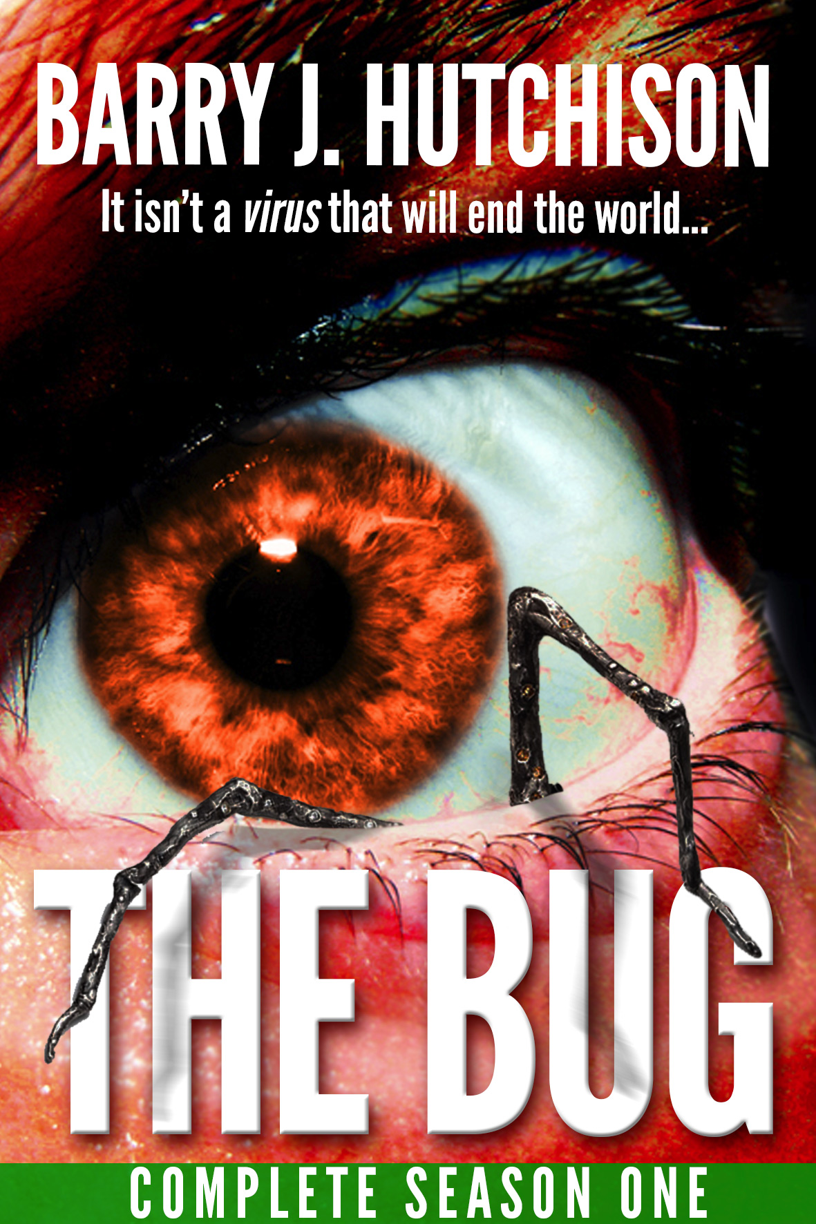
Recently, I’ve been getting a lot of feedback from people that the bug-legs-through-the-eye-socket covers for The Bug are so disturbing they’ve put them off reading the books. Obviously, I’m a fan of disturbing, but if it’s putting people off, then I feel I should look at the covers again.
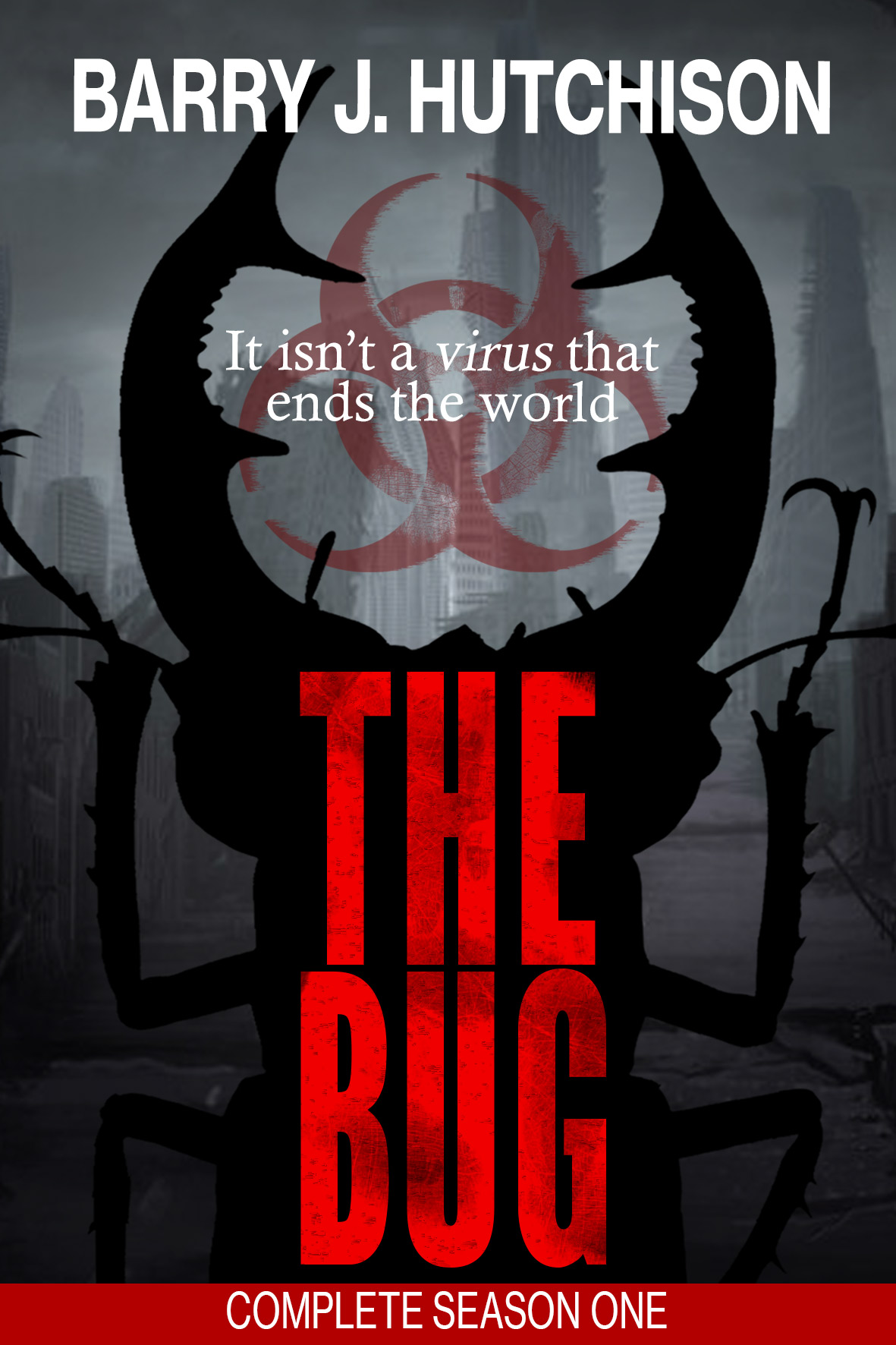
I was thinking of going back to the original cover design, but feel that it doesn’t really convey “post-apocalyptic sci-fi horror” at all. So, I’ve put together a cover for the collected edition which – I hope – works pretty well.
I’d really love your thoughts though, so if you have a moment, please leave a comment below letting me know if you prefer Cover A (the existing cover) or Cover B (the new one). If you have any suggestions for ways to improve either cover, I’d love to hear those, too!
And side-by-side…
Get The Bug – Complete Season One now.

Maybe I am just a sick individual – but I love the eye covers! I wouldn’t change a thing, Barry! Thanks for your interest in my opinion.
m.
Thanks for the feedback, Michelle. In terms of being visually striking (pun totally intended) I think cover A is going to be hard to beat. 🙂
Bookcover B is Better, Barry
Thanks, Dad!
(He’s not really my dad. He’s like a more handsome and intelligence brother, and yet completely unrelated)
Barry,
Personally the original copy doesn’t bother me but I understand the ‘genre’ confusion with it. However, with that said I do like the second cover it seems to relay the more post-apocalyptic feeling than the original.
Thanks for that, Kim. One thing I do find interesting is that on Goodreads, the first two books show up as the original (non-eyeball) covers and they have lots of ratings, reviews and people adding them to their “To Read” lists. The next four have the eyeball cover, and have virtually no activity whatsoever.
Could be coincidence of course…
Cover B is probably more appropiate but I do like cover A
As with Kim, I like cover A but I think that cover B fits the book and its contents better.
Cheers, Alan – really useful to get your perspective.
Hi Barry,
Cover A doesn’t bother me as it’s what attracted me to it in the first place but my son wouldn’t touch it (he has Arachnophobia). Cover B seems to fit your explanation of the series better, giving it a more sci-fi feel.
I would stick with what your gut tells you – you could always ask your audiences what they think at your events and gauge their reactions.
You could always use Cover B for next print run.
Yeah, I think I’ll probably do an experimental change and monitor the results.
Cover A is what drove me to read the series. I love it, it creeps me out and gives me the heebie jeebies. I love eyeball stuff. For me, cover B is boring and If THAT was the book cover I wouldn’t even have bothered reading it.
Very useful to know Cassandra, thanks!
I love the original covers. I am a little morbid and the cover is actually what made me get the books. Don’t change them. They are perfect!!
Thanks for that, Dolores (ya morbid weirdo! :p)
Cover A. Is the best
Just re-read episode zero to confirm – would still go for the eye.
Hi Anne. Thanks for the feedback (and the re-read!) – really useful.
I much prefer cover A Barry. Always my favourite. Sorry I have been missing. I have been diagnosed with leaukemia so have a fight on my hands.
Oh, I’m so sorry to hear that, Helen. Terrible news, but you can overcome it. I’ll drop you an email later. Take care. x
Definitely cover A!!! gorier and more frightening the better and keep up the good work Barry!
Thanks for the feedback, Jim 🙂
Id stick with cover A but that’s just me
Cover B is grand as well but looks like an old video cover
But ultimately it’s about sales so go with whichever one is more sale friendly
Leave the original cover as is! It is a horror novel, if the cover is too disturbing for some people, then they will probably not enjoy the novels. Love the books!
I don’t like cover b. I chose your book because of the eye. I wouldn’t of paid any attention to the other book. Didn’t draw me in.
I have not read the book because of the gross eye / bug leg thing, it makes me want to boak and then bleach my brain so that I can forget what I have seen. Also I think it does send a skewed message regarding content so my vote is for cover B.
The none eyeball one is better. More fitting for the book. I do like the eyeball cover its very cool but it IS disturbing. Almost made me think it wasn’t the type if book I wanted to read.
I like Cover A. It is more compelling and draws my eye, if you will, too it:-)
Never judge a book by its cover.
I prefer Cover B (as I always preferred the originals before they were changed to the eye). In my opinion Cover A doesn’t stand out from the crowd – it looks like a standard stock photo used for e-books (sorry!). Cover B looks professional and reflects more that this is a hard copy book as well as an e-book.
Absolutely cover A! I probably would not have picked the book up to read if it had not been for the cover. Cover B is lame.
Barry,
I guess I am a sick individual but really like the bug/eyeball thing. But if people are disturbed by it then could they choose a different cover? After reading the entire series I can see why you would use that cover. Personally I do not go by the cover just the short summary. If they are that squeamish then they won’t finish the book. Look how many people love the walking dead.
I would love to see yours made into a TV series. Can’t wait to read the next book!! I love your writing!
Thanks, Shirley. I’m still tempted to switch back to that eyeball cover…