As I’ve mentioned before, one of the worst things about indie publishing is that I have to take responsibility for every single part of the publishing process, and not just the writing bit, or the talking about the book afterwards.
I’ve got the first book in a new trad-published children’s series coming out in June, and having someone else handle the cover design, blurb, etc, takes an enormous chunk of the weight off my shoulders.
With The Bug, though, it’s all down to me. Fortunately, this great responsibility also brings with it great power – namely, the power to change the covers whenever I want.
I’ve had a lot of feedback since Episode 1 and Episode 2 launches last week that the covers worked very well as pieces of design, but did nothing to convey the horrors awaiting the reader inside the book. This was bad for two reasons – people buying it not expecting such full-on, nerve-jangling horror might be disappointed, while people looking for that sort of stuff might just skim by without bothering to click.
The net result of these two things could be a lack of sales, and some bad reviews – neither of which I wanted. So I opened Photoshop and set to work, trying to come up with something that better conveyed what the series is about. This is what I settled on for the first three episodes:
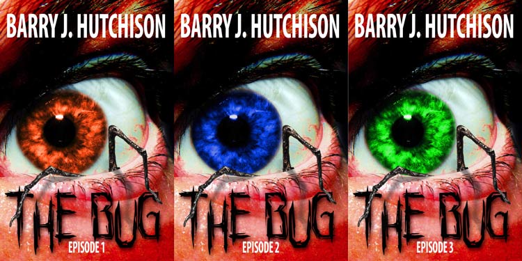
I’d love to hear what you think of the new covers. Do they draw you in or push you away? Let me know!